
The Psychology of Color in Branding That Nobody Talks About
Branding • Logo Design • Visual Identity • Brand Strategy
Most people think a logo is just a pretty symbol slapped on a product. It is not. It is a psychological trigger - one that fires before a customer reads a single word about your brand.
Research consistently shows that color influences up to 90% of a snap judgment about a product. That means before someone knows your company name, your tagline, or your price point, they have already felt something about your branding - because of color alone. This is not just design theory. It is human biology meeting business strategy. And once you understand it, you will never look at branding and logo choices the same way again.
Why Color Is the First Language of Your Brand
Color communicates before language does. It is processed in the limbic system - the emotional center of the brain - which means it bypasses rational thinking entirely. Your branding does not ask for permission to make an impression. It just does.
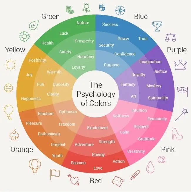
Here is how a few key colors tend to work emotionally:
- Red - urgency, passion, appetite (think Coca-Cola, YouTube)
- Blue - trust, calm, reliability (think PayPal, Samsung)
- Yellow - optimism, warmth, attention (think IKEA, McDonald's)
- Green - health, growth, nature (think Whole Foods, Spotify)
- Black - luxury, authority, sophistication (think Chanel, Apple)
- Orange - energy, friendliness, creativity (think Amazon, Fanta)
None of these are accidental. Every major brand that has survived decades of competition chose its palette with intention - sometimes through years of testing. The mistake most new businesses make? They pick colors based on personal preference. "I like purple" is not a branding strategy. Your logo is not for you - it is for your audience. And your audience has emotional wiring you need to understand before you design a single asset.
The Hidden Rules of Color Combinations in Logo Design
Picking one color is hard enough. Combining them is a whole different discipline. Color theory gives us a framework that professional logo designers use every day - often without ever explaining it to clients.
- Complementary colors (opposite on the color wheel) - High contrast, eye-catching, best for logos that need to stand out immediately.
- Analogous colors (neighbors on the wheel) - Harmonious and calm, great for brands that want to feel cohesive and balanced.
- Triadic colors (three evenly spaced) - Vibrant and diverse, used when a brand wants energy without visual chaos.
Beyond theory, there is the saturation game. Highly saturated colors feel bold and youthful. Muted or desaturated tones feel premium and mature. That is why a startup and a luxury brand can use the same base color - say, navy blue - and feel completely different, because of saturation, shade, and pairing.
Another underrated factor in branding and logo design: negative space. The color of what is not colored in a logo matters just as much. White space breathes. Dark backgrounds command. A logo that works in both scenarios - on a white business card and a dark Instagram post - is a logo built with intention.
Real-World Branding Fails (and What They Teach Us)
Color missteps are not just aesthetic - they cost money and trust. Two of the most studied examples in modern brand history make this painfully clear.
Gap's 2010 redesign became one of the most talked-about branding disasters in retail history. They replaced their iconic blue box logo with a newer, "modern" design. The backlash was so intense they reverted within a week - because the color and identity had become inseparable from customer memory.
Tropicana's 2009 packaging overhaul tells a similar story. They changed the imagery and color cues on their packaging, and sales dropped by 20% in just two months. Customers literally could not recognise their own favourite product on the shelf.
These examples reveal something important: color builds memory. Once your audience associates a color palette with your brand identity, changing it is like changing your face. For new businesses especially, this means getting your branding and logo colors right the first time is not just advisable - it is critical. Rebuilding color-based brand recognition takes years and sometimes millions.
How Sheranis Events Approaches Brand Identity for Events and Beyond
At Sheranis Events, color is never an afterthought - it is a conversation that starts at the very first planning call. Whether it is designing the visual identity for a college fest, building the aesthetic for a wedding, or putting together brand promotion materials for a corporate client, the team understands that every color choice sends a signal.
A bold red-and-gold scheme for a Diwali corporate event feels completely different from soft pastels for a destination wedding - and both are intentional. Sheranis Events also offers web design and brand promotion services, where color psychology plays a direct role in how a business is perceived online. From logo creation to event stage design, every visual touchpoint is crafted to trigger the right emotional response in the right audience.
If you are building a brand or planning an event where identity matters, this is the kind of thinking that separates forgettable from iconic.
FAQs: Color Psychology in Branding and Logo Design
Q1. Does color psychology actually affect buying decisions, or is it overstated?
It is very real, and it has been studied extensively. Research published in the journal Colour Research & Application found that color increases brand recognition by up to 80%. Recognition leads to familiarity, and familiarity is one of the strongest drivers of consumer trust and purchase intent. Dismissing it is a costly mistake for any brand.
Q2. Should a logo use many colors or stick to one or two?
Generally, fewer colors work better - especially at small sizes. Most iconic logos use one to three colors at most. Too many colors create visual noise, and your branding needs to work across dozens of formats, from favicon to billboard. Simplicity scales. Complexity does not.
Q3. Can a brand successfully change its color palette after years of use?
Yes, but it requires careful strategy and phased communication. Brands like Instagram and Mastercard have done it successfully by maintaining some visual continuity while evolving the palette. The key is not to abandon recognition triggers entirely - you evolve them. Sudden, unexplained changes are what cause backlash and lost revenue.
Q4. How do I choose the right color for my brand if I am just starting out?
Start with your audience, not your preference. Ask: who are my ideal customers, what do they value, and what emotional state do I want them to feel when they interact with my brand? Map those emotional states to color psychology research, then test your shortlist against competitors in your space. You want to stand out, not blend in.
Color Is the Silent Salesperson Working for Your Brand 24/7
Color speaks before your copy does, convinces before your pricing does, and stays in memory long after a customer has scrolled past your ad. Great branding and logo design is not about picking colors you love - it is about choosing colors that make your audience feel what you need them to feel.
Get that right, and you have built the foundation of something that lasts. Ready to build a brand identity that actually works? Explore what is possible at sheranisevents.in.
Branding | Logo Design | Web Design | Brand Promotion
0 Comments